Wikipedia:Featured picture candidates/Triangulum.nebula.arp.750pix
Appearance


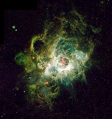
This is just an all-around cool picture. It's a nebula taken by Hubble. Uploaded by Arpingstone, it is used on Nebula, Stellar evolution, H II region, Nebula NGC 604, and it's even on the Template:Space-stub. - Dmcdevit 22:48, 9 Apr 2005 (UTC)
- Nominate and support. -- Dmcdevit 22:48, 9 Apr 2005 (UTC)
- I'll support it too, despite the fact that space-stub is being considered for deletion by WP:WSS (it duplicates astronomy-stub and rocket-stub). Grutness|hello?
 23:45, 9 Apr 2005 (UTC)
 - support lovely picture. Plugwash 00:54, 10 Apr 2005 (UTC)
- Support, but I have to point out Space astub was redundant with {{astro-stub}} and now redirects to it Circeus 01:27, Apr 10, 2005 (UTC)
- So I see. On a related note, has anyone checked out Image:Pleiades large.jpg (which is on {{astro-stub}}); any picture that is on, by my count, 57 genuine articles must have something going for it. --Dmcdevit 01:31, 10 Apr 2005 (UTC)
- Before I vote-This image was taken with the old WIFPC2 CCD imager on Hubble while a newer version taken in '03 with the Advanced Camera for Surveys (ACS) is larger and cleaner. It can be seen here [1] what do you think about replacing the image with that one? The colors are different but they're false color anyway....--Deglr6328 06:54, 10 Apr 2005 (UTC)
- commnet the version we have here has an eiree feel that the other one doesn't seem to share because of the choice of colors. I like that feeling but i can see how the other one is almost certainly a techincally higher quality image. Also the newer version seems to be missing a large section of background Plugwash.
- Support this version. The newer version is even nicer, except for the lower right, which ruins it. :( —Korath (Talk) 11:06, Apr 14, 2005 (UTC)
- Oppose. The choice of false colours here is horrible. Enochlau 14:06, 16 Apr 2005 (UTC)
- Support Astrowob
- Oppose. I dislike the false colors and there appears to be a lot of noise (although those may be stars) --Fir0002 07:42, 19 Apr 2005 (UTC)
- Oppose. Jonas Olson 20:23, 25 Apr 2005 (UTC)
- Oppose. Not all that aesthetically appealing (to me), there's some technical weirdness in the top left corner (probably a mosaicing artifact). But (I know this is late in the game) it's probably worth featuring/not featuring the higher-resolution version from the original site. For what it's worth, I much prefer the newer version linked above (missing corner and all). --Andrew 08:16, Apr 26, 2005 (UTC)
Not promoted +6 / -4 Its a bit borderline, but even several of the support votes seem to prefer an alternative image. -- Solipsist 19:55, 27 Apr 2005 (UTC)
